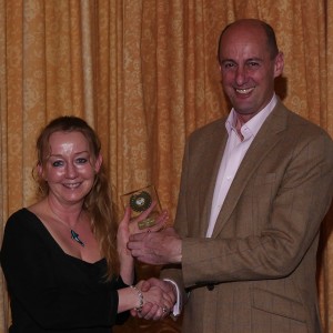
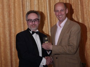
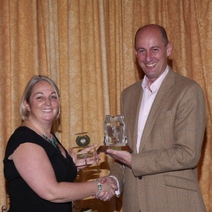
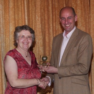
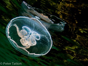
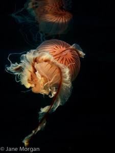
The 2017 Photosub Annual Meal at the Farnham House Hotel was attended by 44 club members and partners. As always it was a very social affair, one of the key goals of the club.
Following a fine meal and drinks the annual competition was projected. This competition comprises 5 categories:
- Green Water Macro/Close Up
- Green Water Wide
- Blue Water Macro/Close Up
- Blue Water Wide
- Prints
There was a good turnout with 147 images across the 4 projected categories (GW-Macro 25, GW-Wide 27, BW-Macro 51 and BW-Wide 44) and 40 prints. Paul Colley, Chairman of BSoUP attended as the judge, accompanied by his wife Vinny.
Comments from Paul are:
Overall It was a great competition to judge, because the image standard was high, including the quality of post-processing. For those interested in process, it was one of gradual elimination: the first cut comprised all images that caught my eye from an artistic perspective and which did not have any obvious technical errors at point of capture or in post-processing; the second cut survived more detailed scrutiny and those which passed this stage received a commendation or higher. Subsequent stages were searches for originality of subject, viewpoint or technique and finer points of artistic presentation. Although this is where subjectivity tends to increase, I do use a formal framework for artistic evaluation.
Technical Although the overall technical standard was impressive, some images had backscatter strong enough to detract (some is natural and acceptable). A few had been cropped to an extent that image quality might have been degraded. And some wide angle images suffered from blown highlights. There were a couple with soft focus or inadequate depth of field. Finally, there were some lighting errors, particularly in wide angle images, which made it too obvious that artificial light was in play. Some images had been over-manipulated, most commonly by heavy boosting of dark tones, which removed too many subtle shadow details in an attempt to improve the overall contrast. Aligning contrast with artistic intent can be a fine line to tread in post-processing.
Artistic Some images had critical amputations of subjects or peripheral objects of high visual weight at the frame edges, which tended to pull the eye off the principal subjects. Viewpoints were generally well chosen and I was impressed with the variety, but in some cases receding subjects or lack of eye contact weakened viewer engagement. A few shots were leaning towards side-on ID style photos which, if not countered by strong dynamics, such as a striking colours, patterns or diagonals, tended to look a bit two-dimensional.
The results are as follows:
Green Water Macro/Closeup
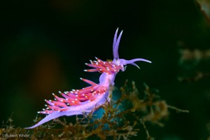
Image 09 (Nudi) First Place – Rob White Viewpoint and lighting give this image a colour and glow that makes shows the subject off to maximum extent. Its habitat is included, but not distracting. There is a light blue glow behind the nudi; either a backlight or a reflection from front light. But the subject was so strongly rendered that I only saw the potential distraction after my third view, so considered it not to be one! A really beautiful image.
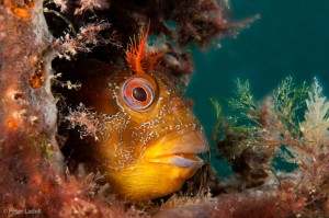
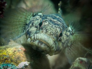
Image 18 (Tompot Blenny) Third Place – Peter Ladell Although side on and not fully engaging the viewer, the combination of good framing and lighting provides striking colour and enough habitat detail to make this image work well. It’s razor sharp and colourful at the critical points, so the viewer gets pulled in to the subject.
Green Water Macro/Closeup Highly Commended
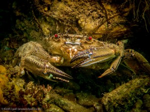
Image 04 (Velvet Swimmer Crab) – Keith Lyall It’s a busy background, but the lighting and post processing are well controlled to let this crab create its presence. The timing to capture offset claws adds dynamism and this subject always pulls your eyes to his if you get the focus and lighting correct, which the photographer has.
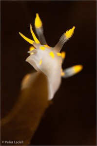
Image 12 (Nudi) – Peter Ladell Lighting, viewpoint and depth of field make the subject positively leap out at you. I think diagonals coming right out of a corner have less impact than those which are offset (landscape photographers will tell you why). And I felt that having one rhinophore out of focus detracted slightly. But well worthy of a highly recommended award.
Green Water Macro/Close Up Commended
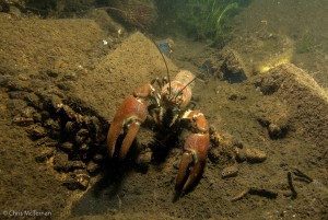
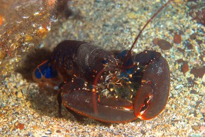
Image 19 (Crayfish) – Chris McTernan The central but diagonal composition increases the impact of the crayfish facing up to the viewer and it’s a sharp image. I thought that the lighting was not quite right, but could have been corrected in post processing by pulling back some highlights top right; the eye finds too much detail there too easily. But a good portrait of a creature with attitude.
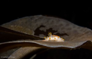
Image 25 (Nudi) -Cat Briggs This is a subtle and effective composition to show a creature in its habitat. There are lots of curves that lead you in to the brightly coloured and well lit subject. The placement along the lower third works well and helps to ground and balance the image, although I thought it might have been stronger still by using either a classic thirds intersection or a dead centre lower third. It seems to sit between the two, but it’s a minor point; I think this is a great image.
Green Water Wide Angle
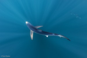
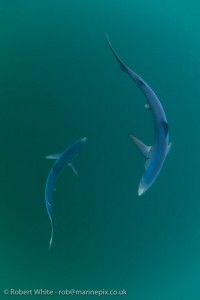
Image 04 (Blue Sharks) First Place – Pash Baker The light has worked in this image to set a lovely background for two contra-rotating sharks, each showing a sinuous sweep of body and tail. It’s the kind of image I would hang on my wall and certainly one that makes me want to be in the ocean.
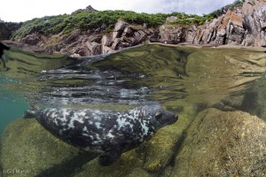
Image 22 (Seal Split Level) Second Place – Gill Marsh The photographer has worked hard to capture interest above and below water, creating a very strong image. The seal’s eyes do not pop out strongly at first and the creature looks a bit wary, but the overall impression is of a beautiful scene that you want to be part of. Top marks for getting this technically-difficult image well executed in tough conditions.
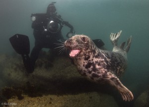
Image 03 (Seal and Diver) Third Place – Nick Blake Although I did not like the diver’s fin being exaggerated so much by the forced perspective of a wide angle lens, the seal’s position and expression is so strong that you cannot help but be drawn in to this image. It tells a story about our photography too. Well lit and nicely timed; a super image.
Green Water Wide Angle Highly Commended
Image 18 (Blue Sharks) – Rob White Although this image lacks a bit of contrast due to the subdued and very diffuse natural light (presumably due to cloud), it is superbly timed to catch the contra-rotation of the sharks, which both have exquisite, dynamic postures. If luck (and light) had been with the photographer, it could have been a stunner.
Green Water Wide Angle Commended
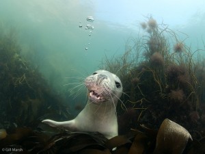
Image 09 (Young Seal) – Gill Marsh The low framing and forced diagonal help this composition, which is well lit. The seal’s eyes do not fully engage the viewer, but there is enough facial interest, especially the teeth, and a few bubbles just burped by the baby seal, to keep people interested.
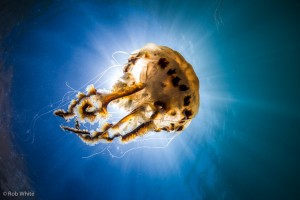
Image 14 (Compass Jelly) – Rob White The very deliberate choice of viewpoint exploits strong backlight, which really strengthens this image. I would love to have seen it against pure blue; the edge of Snell’s window to the left needed to be stronger or not there at all. As it stands, that and the backscatter ended up as a distraction. But the combination of yellow on blue and strong light makes this image grab the viewer’s attention.
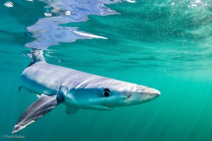
Image 20 (Blue Shark) – Pash Baker The light ripples, a fin cutting the surface and the reflection are all strong compositional elements. There are some minor distractions: a lot of backscatter, a very tight framing bottom left and a perspective forced by the lens that is tending towards the ‘tadpole effect’ when this close in. Nevertheless, it’s a strong image and commended.
Blue Water Macro/Closeup
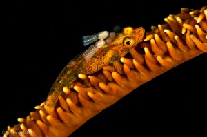
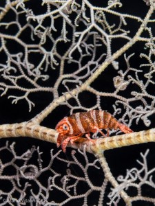
Image 39 (Goby with parasites on whip coral) First Place – Anthony Holley The orange-on-black, diagonal composition and tack sharp focus with a generous depth of field give this image lots of initial punch. The parasites bring additional interest and a story stronger than many others of this type in circulation. Simple, but very effective use of colour and subject to create high visual impact.
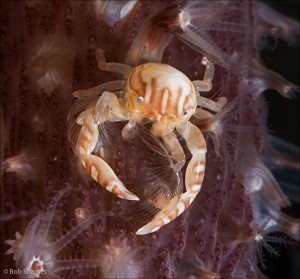
Image 32 (Crab on soft coral) Second Place – Bob Soames Good lighting, perfect depth of field and a square crop all help the crab to pop from its background context, yet still allow enough of the coral to help tell the story. The light against dark heightens the natural contrast and the image is razor sharp. I like the inclusion of a small strip of (dark) water column to the right, which reinforces the dynamics of the image. A well executed picture that was close to the winner in overall impact.
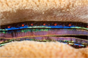
Image 49 (Scallop eyes) Third Place – Peter Ladell There is a strong abstract feel to this image with a sharp focus that brings out the eyes, texture and colours where it matters. I might have reduced the highlights at the edges and perhaps tried a stronger diagonal composition too, but it was great to see something different and with a close viewpoint that drew the viewer right in.
Blue Water Macro/Closeup Highly Commended
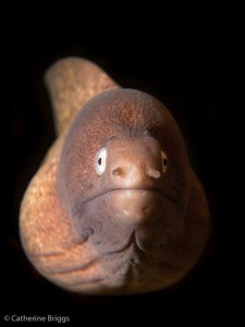
Image 9 (Moray) – Cat Briggs Differential lighting, viewpoint and post processing worked very well to make this subject engage strongly with the viewer. It’s a simple but effective picture with the key elements in sharp focus. The foreground symmetry suits the central framing and strengthens the composition. I wondered whether the processing could have left in some subtle hints of the creature’s lair for context, but it’s a minor subjective point. A strong image.
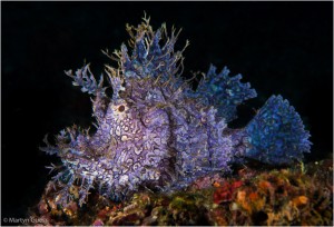
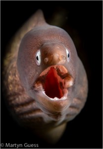
Image 29 (Purple Rhinopia 2) – Martyn Guess The foreground context is more subtle in this image than the previous one of a similar subject, so I immediately felt the full impact of the colour and patterns that comprise this very interesting subject. It is a side-on image, but arguably the subject merits this viewpoint to show the colour and patterns to good effect.
Image 33 (Shrimp on Crinoid) – Mario Vitalini This is a classic thirds composition that exploits good lighting, a great background and a colourful subject looking into the frame; all to wonderful effect. It was the image that first caught my eye when I opened the files. It appears slightly less sharp than those that made the top three, but has high impact.
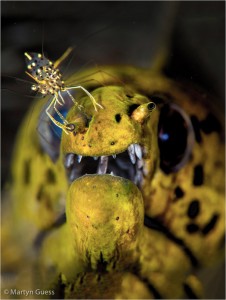
Image 36 (Cleaner shrimp on Moray) – Martyn Guess At first pass, this image felt a little messy, because the moray’s eyes are out of focus. However, the shrimp is sharp and the moray here is a secondary subject. What works exceptionally well is a nostril being bent down by the shrimp and an apparent lip-curling grimace from the moray. I felt his pain at having his nose tweaked and this image made me laugh. A really good behaviour shot.
Blue Water Macro/Closeup Commended Images
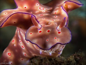
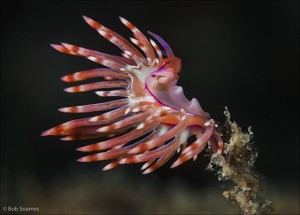
Image 05 (Nudi) – Bob Soames A very striking image from a great viewpoint. The colour and pin-sharp rhinophores engage the viewer. I felt that the elements leaving the frame were sufficiently in focus to pull the eye to the edges, but I liked the overall image.
Image 10 (Nudi) – Bob Soames The viewpoint, depth of field and well-controlled light picking out the colour all help to isolate the subject. A super composition.
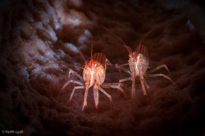
Image 26 (Shrimps in a sponge) – Keith Lyall Great engagement with good lighting and focus on the subjects to pick out the fine detail and colour, whilst retaining the overall context. The snoot or post-processing dark vignette was for me a little heavy and gave image a slightly artificial feel. But the subjects pop and it is technically well executed.
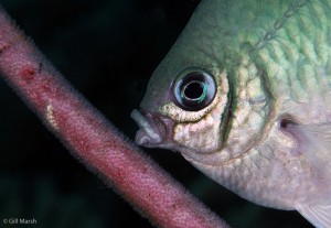
Image 30 (Damselfish tending eggs) – Gill Marsh A fine behaviour shot in sharp detail at the peak of the action. Very good composition too, with the diagonal egg-bearing structure crossing the frame edges at the right places. The colours, for some reason, are a bit muted and this is one image that could have stood a little more use of darks and shadows to really accentuate the subject. But a great capture.
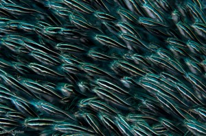
Image 38 (Catfish school) – Pash Baker I loved this image and was pleased to see use of a creative technique to try and accentuate movement. The school nicely runs right to the frame edges and the light picks out the important little details like the whiskers. I also liked the diagonal composition.
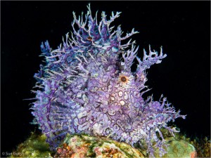
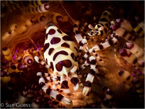
Image 40 (Purple Rhinopia 1) – Sue Guess The photographer nicely isolated a very cool subject with good lighting to reveal the dominant aspects of the composition; shape and colour. The green foreground is part of the context, but a little distracting and it might have benefited from some subtle (additional?) reduction of competing contrasts in that bottom part of the frame.
Blue Water Wide Angle
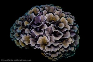
Image 34 (Hard Coral) First Place – Rob White Whilst the second and third place images were higher impact through the use of colour, they were both achieved through conventional approaches. What grabbed me about the image that I placed first was its simplicity and relative originality. Not many people try it, but I’m guessing it’s a night or dusk wide angle that helps to isolate the beauty of a natural feature. The overhead viewpoint is well chosen to let shadows cast by the strobes define the shapes of individual corals. With some subtle hints of colour, it’s a peaceful image and almost abstract. The framing at the bottom is a bit tight, but I give high marks for originality of approach to achieve a striking image.
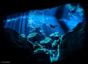
Image 31 (Diver in Cenote) Second Place – Nick Blake A very high impact simple image exploiting natural light to beautiful effect. Tack sharp, a strong frame-within-frame and a sense of scale and place with lots of mood. An image I want to have on my wall.
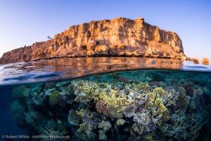
Image 19 (Red Sea Split) Third Place – Rob White Well controlled dynamic range and depth of field to create an iconic Red Sea picture telling the story of beautiful coral gardens below rock and sand. Really well captured colours.
Blue Water Wide Angle Highly Commended
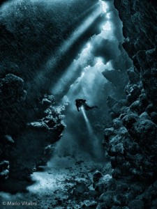
Image 04 (Diver in Cave) – Mario Vitalini Simple, but atmospheric, this image exploits natural light to great effect. The diver is beautifully framed and his torch beam gives nice positional contrast to the light beams streaming from above. Excellent use of light.
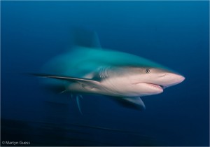
Image 18 (Reef Shark) – Martyn Guess Great technique to bring movement into this image and it’s well lit with the vital bits sharp. I could not decide whether the wreck blurring at the bottom added or detracted. It’s part of the real context, but I had to dwell on it to work out what it was and so wondered whether a completely clean background (more upward angle from a lower viewpoint) might have allowed the viewer to feast eyes on the beautifully captured main subject. A strong image.
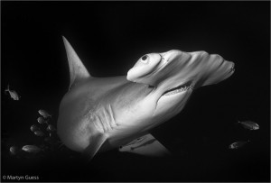
Image 40 (Hammerhead and Friends) – Martyn Guess A very graphic high impact shot. Eyes, snout and teeth are all there and the light uses shadow to both isolate the subject and emphasise myriad detail in this charismatic big animal. The secondary subjects (small jacks and remora) make it an even stronger image.
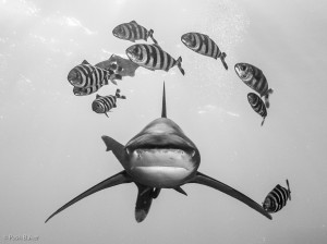
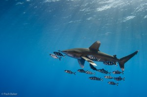
Image 43 (Oceanic White Tip Head On) – Pash Baker These are hard-to-get images. I’m not sure if it’s a pseudo wide angle using a long lens or a cropped wide angle, but the result has impact. The pectorals and dorsal make a classic Mercedes shape and I like the tail sweeping out left to add movement, reinforced by the trajectory of the pilot fish. Getting some light on the snout picked out face detail. It’s unlucky that the bottom right pilot fish merged with the pectoral. Good work.
Blue Water Wide Angle Commended
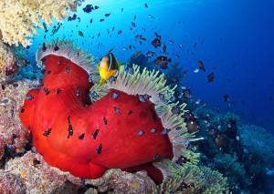
Image 03 (Anemone & Fish) – Gill Marsh This type of image is quite common, but still well executed with accurate framing, focus and lighting to give a lot of colour and impact. Nicely done.
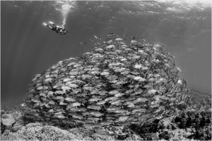
Image 05 (Schooling Jacks and Diver) – Martyn GuessThis is a very well framed and timed shot. The contra- rotation of diver and fish keep it tightly composed, with the diver adding both sense of scale and part of the story. It’s very well lit and I only wondered if the highlights on the right hand side and around the edges could have been reduced just a bit to really centre the viewer’s eye on the action; my eye did wander to the brighter edges. A lovely image only a whisker off the final cut.
Image 13 (Oceanic White Tip and Pilot Fish) – Pash Baker I like the more distant viewpoint here that brings in a sense of the upper open ocean that defines the habitat of this pelagic species. But it was also close enough to get some light coming into the camera sensor from the shark and the pilot fish, telling the story with colour and detail. A good image of a predator in its habitat.
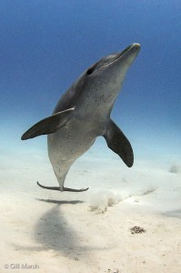
Image 26 (Dolphin) – Gill Marsh There’s quite a bit of noise in this image, but the timing and framing is spot on. The diagonal adds a dynamic, as does the downward tail beat creating the puff of sand. There is a lovely sense of depth perspective created by the animal and its shadow. If post processing rules had allowed, I would have toned down the shadow on the right hand edge of the frame about one third up from the bottom; it’s a minor distraction. If this was shot in portrait, full marks. If it was a crop from horizontal, it might explain the noise and loss of detail, but the image has impact.
Image 30 (Manta Train) – Mario Vitalini The water column through which the photographer shot this image both adds and detracts. It adds aerial (depth) perspective, reinforcing the reducing relative size of the mantas, but also strips out some detail, slightly reducing the contrast. But the moment is captured and I loved the train looming out of the distance, with lots of dynamics from wing positions and overall shape of the train. A most enjoyable image. I wanted to be there.
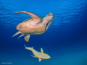
Image 35 (Turtle and Remoras) – Mario Vitalini A super image that catches a not-so-common separation of one remora from its turtle host and with almost perfect timing. The diverging lines set against pure blue, with the surface in sight and the hint of yellow and orange adds colour contrast to already- well-defined shapes. Seeing the upper parts of the remora and lower parts of the turtle adds to the perspective and dynamics of the image. If only the outer turtle wing had been lower…that little bit of luck could have turned this great shot into an absolutely fabulous one.
Ocean Whitetip – Pash Baker
Clownfish – Wendy Eve
Dolphin – Mario Vitalini
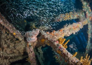
Aircraft Wreck – Mario Vitalini
Clownfish – Martyn Guess
Seal – Jane Morgan
Moray – Cat Briggs
Dolphins – Ken Sullivan
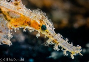
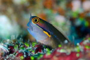
Frogfish – Martha Tressler
Jellyfish Selfie – Anthony Holley
Clownfish – Cat Briggs
The Len Deeley Trophy
Following the death of club founder and driving force Len Deeley, a new trophy was created by Pash Baker and Jo Horrocks in memory of Len. This trophy will be presented on an annual basis at the annual dinner. It will be classed as a “floating trophy” and while on some occasions it will be presented based on a competitive basis defined by the committee, on others it will be presented to a club member who has supported the club and promoted its aims and goals.
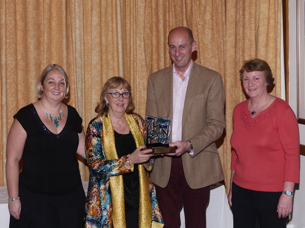
Following the sudden death of Len Deeley in 2016, the committee decided that the first recipient should be Len & Pat Deeley to recognise the unwavering and steadfast support provided to the club since its inception. The trophy was presented to Pat Deeley by Paul Colley, Pash Baker (left) and Jo Horrocks (right).
Awards Presentation
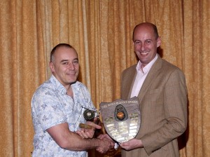
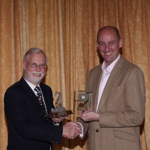
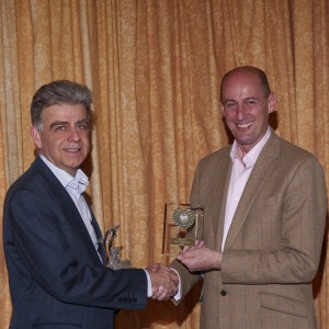
Rob White & Paul Colley (Green Water Macro Winner)
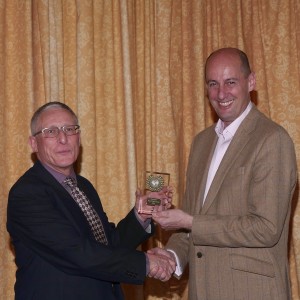
Jane Morgan & Paul Colley (Green Water Macro 2nd Place)
Peter Ladell & Paul Colley (Green Water Macro 3rd Place)
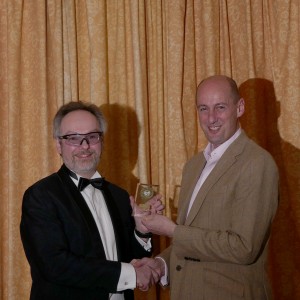
Pash Baker & Paul Colley (Green Water Wide Winner)
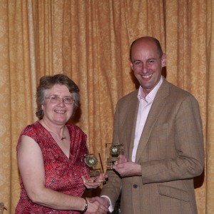
Gill Marsh & Paul Colley (Green Water Wide 2nd Place)
Nick Blake, Green Water Wide 3rd place was unable to attend the meal
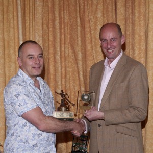
Anthony Holley & Paul Colley (Blue Water Macro Winner)
Bob Soames & Paul Colley (Blue Water Macro 2nd Place)
Peter Ladell & Paul Colley (Blue Water Macro 3rd Place)
Rob White & Paul Colley (Blue Water Wide Winner & 3rd Place)
Nick Blake, Blue Water Wide 2nd place was unable to attend the meal
Peter Tatton & Paul Colley (Print Winner)
Gill Marsh & Paul Colley (Print 2nd & 3rd Places)
Thanks
Our thanks to Paul Colley for judging the competition, and to his wife Vinny for attending the meal and competition evening.
These events cannot run without the help of a number of club members. Thanks to Bob Soames for acting as master of ceremonies, Keith Lyall for organising and running the competition, Pat Deeley for providing the balloons and table place tags, Bert Lee for providing the display stands (assembled with the assistance of Ken Sullivan, Mike Maloney and Chris McTernan), to Sue Guess for laying out the prints, Jo Horrocks for setting up the trophy table, Rob White for helping with final projection setup, Peter Ladell for taking the winners photographs, and to Martha for arranging the tables and doing the other logistical stuff in the background that people are not aware of.

